Domino’s just dropped its first brand refresh in 13 years, and it’s the complete opposite of what most companies do when they rebrand. While brands like Cracker Barrel, Gap, and Tropicana rebranded out of desperation (and mostly failed), Domino’s is doing it from the top.
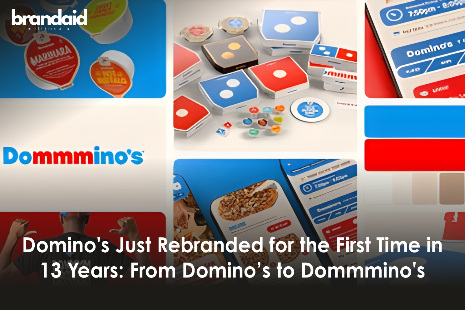
The pizza giant unveiled the refresh on October 8, 2025, introducing brighter reds and blues, a bold new typeface, redesigned packaging, and a jingle that literally adds extra “m’s” to their name – “Dommmino’s”. Oh, and they got Grammy-nominated artist Shaboozey to voice it.
What Actually Changed in Domino’s
The “Cravemark”
Instead of a traditional tagline, Domino’s trademarked “Dommmino’s” – stretching the “mmm” sound to make craveability part of their actual name. They’re calling it a “Cravemark”.
Brighter color palette

More vibrant shades of red and blue across packaging, signage, employee uniforms, and all brand touchpoints.
Domino’s Sans typeface
A custom bold font with perfect circles and sharp edges that reference pizza and pizza boxes.
Premium packaging design

Standard boxes feature the logo more prominently on red or blue backgrounds. Handmade Pan and Parmesan Stuffed Crust pizzas get black boxes with metallic gold logos.
New jingle by Shaboozey
The crossover country-rap star behind “A Bar Song (Tipsy)” co-created the audio branding that says “Dommmino’s”.
Updated employee uniforms
New aprons, hats, and promotional t-shirts launching in November.
Why Now? The Strategy Behind Rebranding From Strength
CMO Kate Trumbull explained it perfectly: “Most companies rebrand themselves when they’re struggling, but after years of category-defying growth, this refresh is about continuing to push to be the best version of ourselves”.
Conclusion
Domino’s rebrand represents a masterclass in proactive brand evolution.
The “Dommmino’s” Cravemark feels gimmicky until you realize it solves multiple problems:
- it’s universally translatable across 12 markets
- works in audio and visual formats, and
- literally embeds the brand’s core benefit (craveable food) into the name itself.
For marketing agencies watching this rollout, the lessons are clear:
modern rebrands need to be designed for how consumers actually interact with brands today – through phones, social media, and user-generated content.
With this rebrand, Domino’s rebuilt their entire visual and audio identity for the TikTok generation.
Whether this drives immediate sales remains to be seen.
But by repositioning themselves as vibrant, bold, and modern while maintaining their core identity, Domino’s has set themselves up for relevance with the next generation of pizza lovers.