Have you noticed something different about Google lately?
Probably not.
Because the change is subtle, but it’s there.
After nearly a decade of sporting the same look, Google has finally given its iconic ‘G’ logo a makeover. And we’re here for it!
They quietly rolled out this update in May 2025, marking the first significant change to its logo since September 2015. Talk about playing the long game!
So What‘s Actually Different with the Google logo?
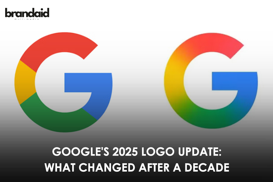
If you‘re squinting at your screen trying to spot the change, here’s the scoop: the shape of the ‘G’ hasn’t changed at all. What’s new is how the colors blend together.
Remember how the old logo had four distinct color blocks? The red, yellow, green, and blue sections were clearly separated, like neighbors who never talk to each other. Well, those neighbors are now becoming friends!
In the new design, the colors flow into each other with a smooth gradient effect. The red gently melts into yellow, which then transforms into green, finally ending with blue.
It‘s subtle yet refreshing.
Why Should You Care About Some Colors Blending in the Google logo?
You might be thinking, “It’s just some colors blending together. What’s the big deal?” Fair question!
Here‘s why this tiny change actually tells us something interesting: the new gradient style matches exactly what Google has been doing with its AI products lately.
Both Gemini (Google’s AI assistant) and the AI Mode in Search use similar gradient effects in their branding.
So they’re visually telling us that AI is now at the core of everything they do. The main Google brand is aligning with its AI future- pretty clever way to signal that shift without saying a word, right?
Where Can You Spot the New ‘G’?
If you‘re now frantically checking all your Google apps, you might not see the change yet. The company is rolling out the update gradually.
So far, the refreshed logo has appeared on the Google app for iOS devices and on Pixel phones. If you‘re using other Android devices or browsing on the web, you’ll probably still see the classic segmented ‘G’. But not for long!
Logo Evolution: A Quick Trip Down Memory Lane
This isn‘t their first logo update.
Way back in 1997, Sergey Brin created the original Google logo using GIMP (yes, really!).
Then in 1999, designer Ruth Kedar created the colorful logo with the Catull font that many of us grew up with.
Fast forward to 2015, and Google introduced a cleaner look with its custom-designed Product Sans font and the segmented ‘G’ icon that we’ve known and loved until now.
And here we are in 2025, witnessing the next chapter in Google‘s visual story.
What This Tells Us About Design in 2025
Google‘s move from flat colors to gradients actually reflects some broader trends we’re seeing across design this year:
After years of super-minimalist flat design (thanks, Apple circa 2013), brands are adding more dimension back—but in subtle ways. Gradients are having a moment again, but they‘re more sophisticated than the glossy bubble effects of the early 2000s.
Companies are also realizing that complete redesigns can backfire. Remember the Jaguar logo outrage?
Instead, they‘re opting for evolutionary changes that feel fresh without losing recognition.
This update hits the sweet spot. It modernizes Google‘s look while respecting its heritage. The gradient effect feels timely without being trendy, and the connection to Google’s AI branding shows thoughtful intention behind the design.
Plus, it‘s just plain pretty. Who doesn’t love a good color blend?
What do you think about Google‘s refreshed look? Have you spotted it in the wild yet? Drop us a comment below- we’d love to hear your thoughts!
P.S. Thinking about refreshing your own brand‘s look? A subtle update like Google’s can sometimes make a bigger impact than a complete overhaul. Let’s chat about how we can evolve your visual identity while keeping your brand recognition strong!
Follow Brandaid Multimedia for more such fun updates!


