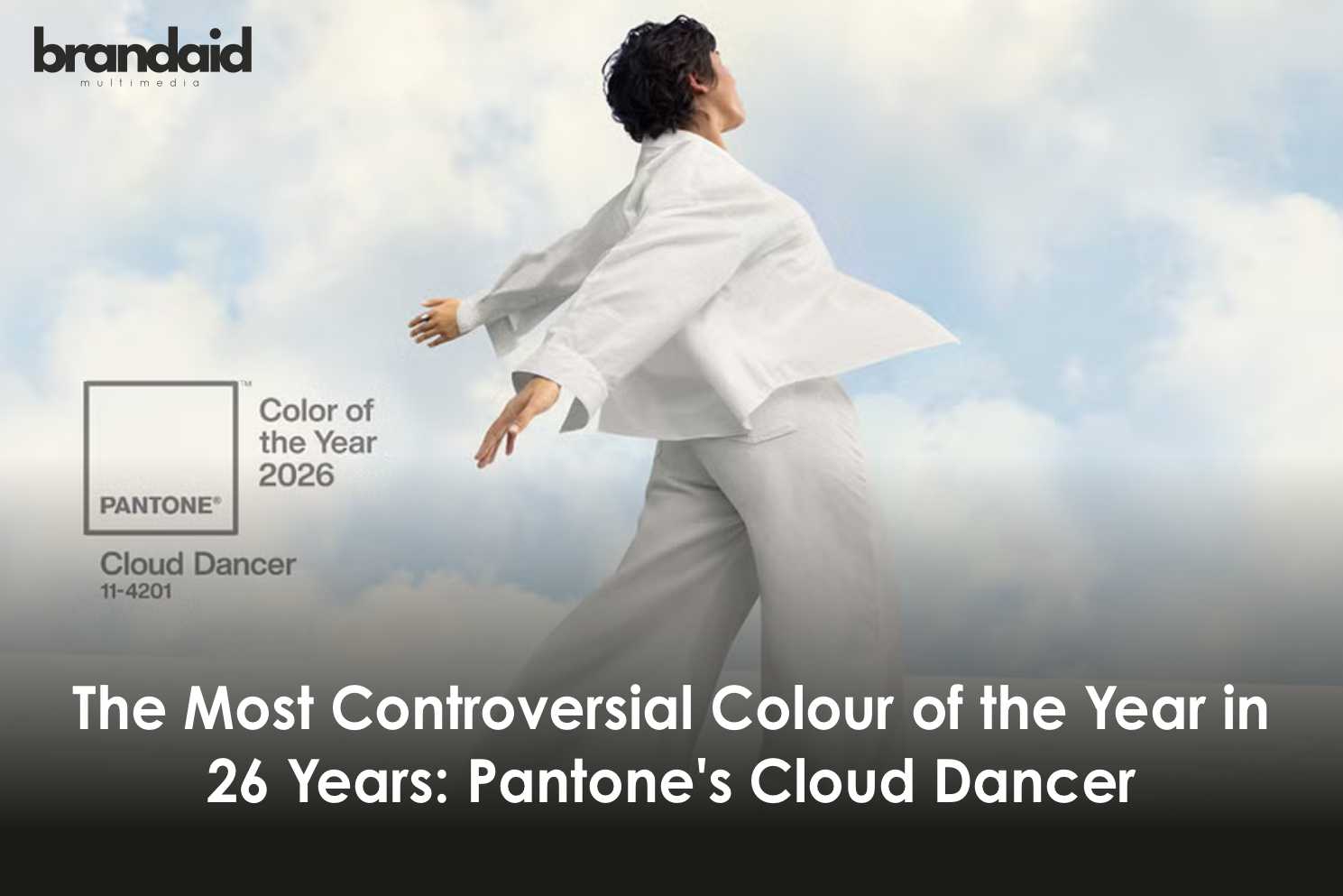
Pantone announced Cloud Dancer as its 2026 Colour of the Year on December 4, 2025. It’s a soft, billowy white meant to symbolize calm, clarity, and fresh beginnings.
The reaction was instant. And it wasn’t calm.
“Is this rage bait?” one Instagram comment asked. “Go girl, give us nothing,” said another. Within hours, the announcement was branded “tone-deaf,” “boring,” and even “racist”.
This is the first time Pantone has chosen a shade of white in 26 years. And it might be the most controversial Colour of the Year pick in the company’s history.
What Is Cloud Dancer?
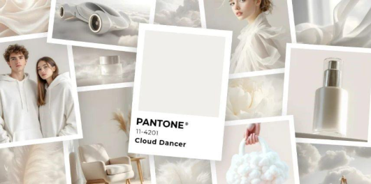
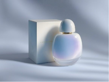
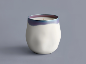
Cloud Dancer (PANTONE 11-4201) is officially described as “a billowy, balanced white” that offers “a calming presence in a chaotic world”.
According to Laurie Pressman, VP of the Pantone Colour Institute, it’s a “discrete hue offering a promise of clarity” that helps us refocus when “the cacophony around us has become overwhelming”.
Leatrice Eiseman, executive director of the Pantone Colour Institute, calls it “not a stark white,” but rather “a natural shade of white” meant to serve as a blank canvas for creativity and renewal.
It’s soft. It’s neutral. It pairs with everything. And according to Pantone, it’s exactly what we need in 2026.
Why Pantone Chose White Now
Pantone picks its Colour of the Year based on cultural, social, and economic trends analyzed months in advance.
For 2026, the theme is transformation and reset. Pantone says we’re living in a time when digital overload is drowning out our inner voices, and we need simplification.
Cloud Dancer is meant to be:
- A blank canvas for fresh starts and new beginnings
- A calming anchor in overwhelming times
- A balance between our digital existence and need for human connection
- A backdrop that enhances focus and allows creativity to breathe
The name itself is intentional. “Cloud Dancer captures a universally shared experience: no matter where we are, we all look up to the floating clouds for inspiration, wonder, and a spark of creativity,” a Pantone spokesperson explained.
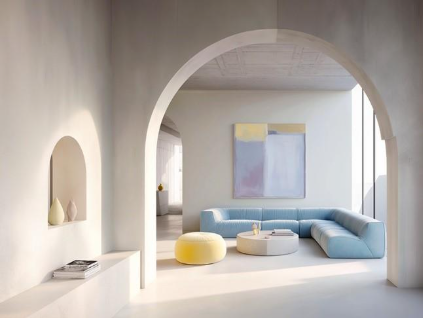
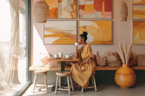
In design terms, Eiseman says it offers “clarity without coldness, structure without rigidity,” making it ideal for pairing with natural materials like wood and stone.
The Controversy: Why the Internet Exploded
Pantone predicted calm. They got chaos.
The backlash was immediate, and it came from multiple angles:
“It’s Not Even a Colour”
Many critics pointed out that white is technically the absence of colour—or, depending on your perspective, all colours combined.
“Is the colour in the room with us?” one Instagram user sarcastically asked. Others called it “the colourless colour” and “lazy”.
This is Pantone’s first true white selection in 26 years- their closest previous pick was “Sand Dollar” in 2006, which leaned more beige.
“It’s Boring and Uninspired”
After years of bold picks—Viva Magenta (2023), Peach Fuzz (2024), Mocha Mousse (2025)—a neutral white felt like a letdown.
“So…white. I guess we’re all feeling completely uninspired these days,” one comment read.
Fashion critics noted that the industry is already drowning in neutrals. “There’s no Brat green or Barbie pink. Given this minimalism, I would have preferred black,” one New York Times fashion critic wrote.
“It’s Politically Tone-Deaf”
This is where the backlash turned sharp.
Critics called the choice “painfully tone-deaf” in a political moment marked by rising white nationalism, rollbacks of DEI initiatives, and debates about race and identity.
One widely-liked comment said: “When white supremacy is resurfacing loudly in national leadership and policy,” choosing white as the colour that represents calm and renewal feels oblivious at best.
ArtNews published a scathing piece titled “Pantone’s 2026 Colour of the Year, a Shade of White, Is Tone Deaf,” arguing that the selection evokes “white supremacy rather than serenity”.
The article pointed out that Pantone’s emphasis on whiteness as a “standard” against which everything else is measured—combined with current US political rhetoric around “White culture” and anti-DEI policies—makes the timing especially fraught.
Pantone’s Response
When asked about racial interpretations, VP Laurie Pressman told the Washington Post: “Skin tones did not play a role in this at all”.
Critics called this statement revealing—a form of “racial colourblindness” from a company that positions itself as a “leading source of colour expertise”.
Some observers believe the controversy was intentional. Multiple users labelled it “rage bait,” suggesting Pantone knew exactly what they were doing.
“So they basically admit they knew it would be controversial,” one Instagram comment with 700+ likes said. “It seems they wanted to leverage free publicity by provoking outrage”.
How Cloud Dancer Will Show Up in 2026
Regardless of the backlash, Pantone’s Colour of the Year drives real commercial decisions.
Cloud Dancer and its Pantone trademark will appear on products from Motorola smartphones to Command strips, Post-it Notes, Joybird furniture, and more.
Pantone curated seven colour palettes to accompany Cloud Dancer:
- Powdered Pastels: Delicate hues like Lemon Icing and Peace Dust
- Take a Break: Playful flavors like Pink Lemonade, Papaya, Cocoa Crème
- Atmospheric: Airy tones like Cosmic Sky and Dusky Citron
- Comfort Zone: Earthy shades like Rose Brown and Mountain Trail
- Paradise Found: Bright tropical colors
- Light & Shadow: Softened hues and shadowy tones
- Glamour & Gleam: Hollywood drama with black, wine, and metallic accents
(To get the colour palettes for all of them, visit their official website here)
In fashion, interiors, and branding, expect Cloud Dancer to serve as the neutral foundation for 2026 collections and campaigns.
Conclusion
Pantone named Cloud Dancer(a soft white) as the 2026 Colour of the Year. They said it would bring calm. It brought controversy.
Whether you see it as a soothing reset or a tone-deaf political statement, one thing is clear: this is not a colour that goes unnoticed.
For the first time in 26 years, Pantone picked white. And for the first time in memory, their pick sparked this much immediate backlash.