How KitKat Turned a Dash Into an Ad
KitKat has spent decades telling us to “Have a break.”
Now, they don’t even have to say it. They just have to show it.
In the latest KitKat OOH campaign for Nestlé Canada, created by agency Courage, KitKat replaces one of the most common symbols in typography:
the dash — with a single KitKat wafer finger.
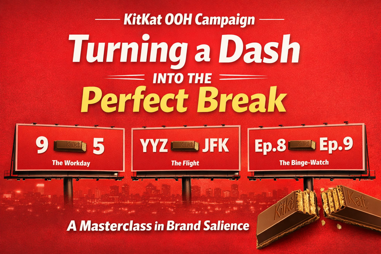
The billboards show simple pairings like:
9 — 5 (The workday)

YYZ — JFK (The flight)

Ep.8 — Ep.9 (The binge-watch)

But the dash in the middle is swapped for the iconic chocolate bar. The idea is brilliantly simple: the dash already represents a pause between two things. KitKat just moved into that space.
Why This Idea Works So Well
1. It Uses Existing Context
Joel Holtby, founder and co-chief creative officer at Courage, explained that the dash was “hiding in plain sight.”
A dash inherently signifies the space between two points.
By inserting the wafer exactly where the dash goes, the KitKat OOH campaign isn’t forcing a new behaviour. It simply reminds people that the “in-between” moment is a break — and KitKat owns breaks.
2. It’s Designed for OOH Speed
Outdoor advertising needs to be understood in less than 3 seconds.
This campaign uses:
- a bright red background
- stark white text
- a distinct product silhouette
There’s no complex body copy to read. You get the idea instantly, making the KitKat OOH campaign highly effective for billboards where attention spans are shortest.
3. A Masterclass in Brand Salience
When branding is incredibly strong, you don’t even need a logo to be recognized.
The campaign strips away everything but the brand’s core elements:
- the red colour
- the four-finger bar shape
- the association with taking a break
As Nestlé Canada CMO Tracey Cooke noted, the campaign finds “a fresh way to express something people already know and love about the brand.”
Brand salience simply means how quickly and easily a brand comes to mind when someone is ready to make a purchase. It’s not just about recognition—it’s about being the first brand people think of when they want to buy.
The KitKat OOH campaign is a perfect example of this principle in action.
Where the Campaign Lives
This isn’t just a traditional billboard run.
The KitKat OOH campaign has rolled out nationally across Canada spanning:
- out-of-home
- digital
- social media
- streaming platforms like Netflix
By adapting the message to the medium—for example:
Ep.8 — Ep.9 for streaming audiences
7th inning — 8th inning for sports contexts
KitKat places the break exactly where it naturally happens in everyday routines.
Conclusion: What Brands Can Learn
Most brands try to add more noise to get attention.
KitKat did the exact opposite.
They removed the logo, the tagline, and even a punctuation mark.
The KitKat OOH campaign proves that decades of consistent brand building around “Have a break” has paid off. When a brand owns a concept deeply enough, something as small as replacing a hyphen with a wafer can become one of the smartest advertising ideas of the year.